I don’t know about the rest of you, but I was starting to think the old layout of Zizzle-Zot, etc. was getting a little tired, and thereby made the executive decision that it was the perfect time to go out and get the emperor a new set of clothes.
Without further ado, welcome to the new (and improved?) Zizzle-Zot, etc.
It’s my goal to make this an interactive experience, so if you’ll direct your attention to the side bar on the right of the screen you’ll see that I’ve added a poll (newly discovered feature). Whether you love the new layout or think it bites and wish I would go back to the old one, please vote and make your opinion known. Polling will close at the end of the week, at which point I’ll make necessary adjustments.
Also, feel free to comment throughout the week on how I could make this blog better (keeping in mind that the creator of Zizzle-Zot, etc. is a techno-idiot and won’t be capable of any great feats of computer wizardry).
I look forward to hearing your feedback. Let the voting begin.
Thanks for reading.
Monday, July 16, 2007
Subscribe to:
Post Comments (Atom)


4 comments:
The new site is just ok in my book...i just don't think it really screems Zizzle-Zot
I like it because it looks more professional. Whatever happens though it doesn't really matter to me because I'm soley concerned about the content and you already got that down!
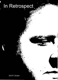
I like it, but that picture makes you look even more pretentious than you already are for having a blog. But I say the more pretentious the better! Overall, its a good makeover for the Zot.
I was thinking that when I posted it (about the picture). It is crazy pretentious, but to hell with it...I already have a blog, so the pic is just a cherry on top.
Post a Comment